Big Updates to the RotoTracker Dashboard
Sexy graphs abound.
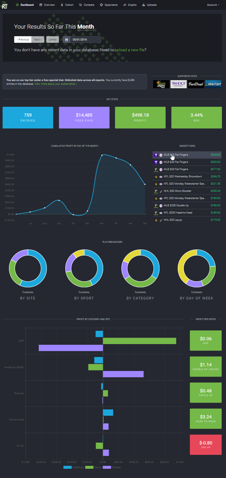
Last week we rolled out a major update to the RotoTracker dashboard, adding new graphs, rolling out a bunch of improvements and fixing a few bugs.
Probably most notable is the Visualize Profit chart has had a total revamp, switching to a new horizontal bar graph and adding a whole new "profit per entry" display. The graph will switch intelligently between site and sport depending on what you play, and now shows up to five categories.
Also getting an overhaul is the cumulative profit chart, which is now much smarter. It will switch between cumulative profit by contest, day of the week or month depending on how much you've played, and it will sample your data so there's always the right number of data points to display. It handles negative values much better (not that you'd ever see that!), has improved axes, and a bunch of other fixes.
There's over a dozen other improvements with rolled in to this update. Just to name a few: You'll notice the date navigation stays with you as you scroll, the top contests lists is expanded to show your best 10, display on mobile and tablet is much improved, and you'll find more slices in the donut charts.
Head to your dashboard now to check out the new features, and let us know what you think!
- Published on June 01, 2016
- permalink